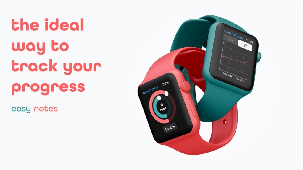
Easy Notes
My Role – Experience Design, UI Design, Branding, Research
Teams Size – 1
Project Overview
This project was a case study, in which I took a problem out of my everyday life, and worked on a creative solution through really diving deep into the problem and understanding the pain points.
Problem
Nearly everytime I go to the gym, I see people writing down their progress in a notebook. But why are they doing this, since there are a lot of apps available, which let people track their progress digitally? The problem is, thos companies try to sell their customers more than they actually want.
1 - Research and Discovery
Field Study
To understand the users and gain deeper knowledge about the problem, I conducted a field study in a gym, where I did a contextual inquiry and asked people that were using notebooks: “Why are you using a notebook, even though there are multiple apps that can track your progress?”
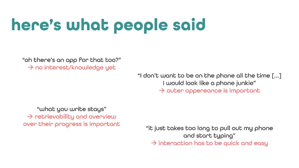
I found three main problems:
- Interactions are not optimized for use during weightlifting sessions
- Apps are too complicated/overloaded
- Impression of beeing on a smartphone in the gym is not ideal
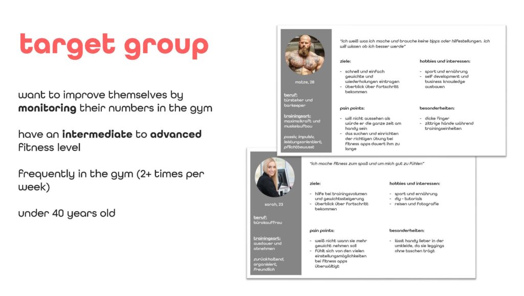
Based on those findings, I built personas to ensure I designed with the right users in mind.
2- Ideation
Generating a concept
To start things of, I formulated one or two “how might we?” questions for each problem field.
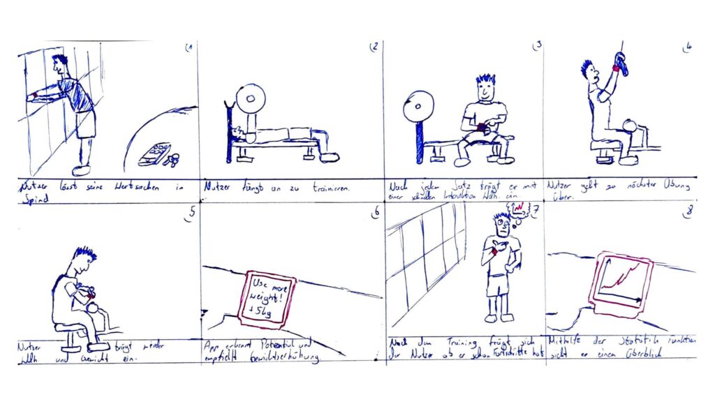
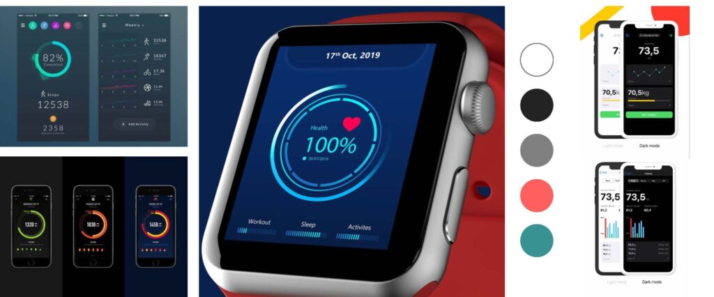
Building on that I defined a use flow, as well as a mood board to get a feel for what I want the app to look like.
3 - Design
Wireframes & Screendesigns
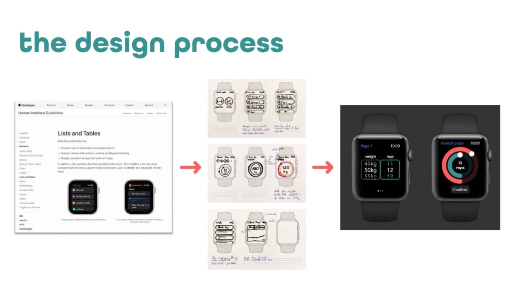
Before getting into designing wireframes, I looked at the hardware that I wanted to enroll my app on. For this work I chose the Apple Watch. I made myself familiar with the design system and started with the wireframes.
The next step was to build a high fidelity UI. For this I used Adobe Xd. It was perfect, because it enabled me to transfer objects quickly between Photoshop, Illustrator and Xd and streamlined my work.
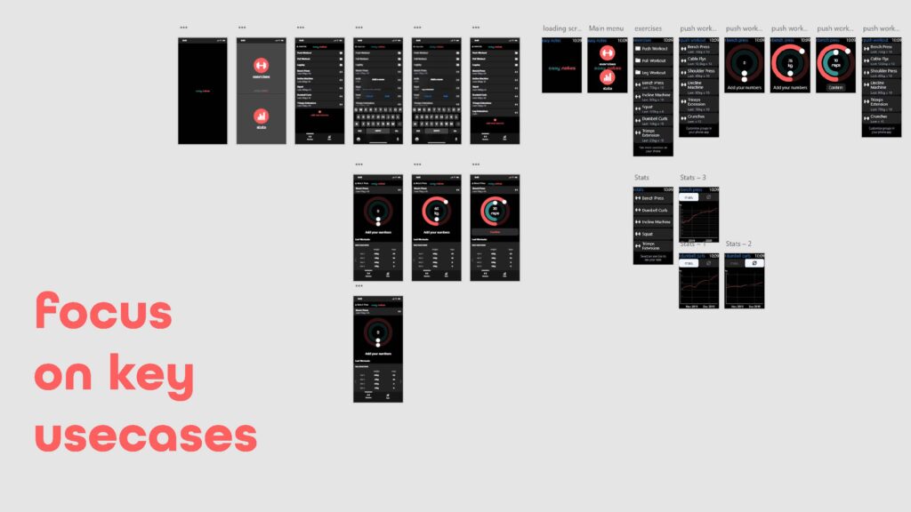
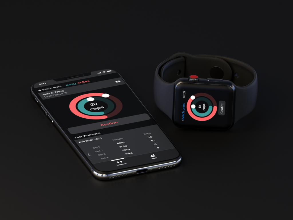
The functionality was split into two parts. Complex functions, i.e. profile management, tables of personal progress and building new workout routines were located in a smartphone app. Only the functions, that were critical during the workout were included in the watch application, to reduce clutter and let the user focus on the task at hand.
Branding
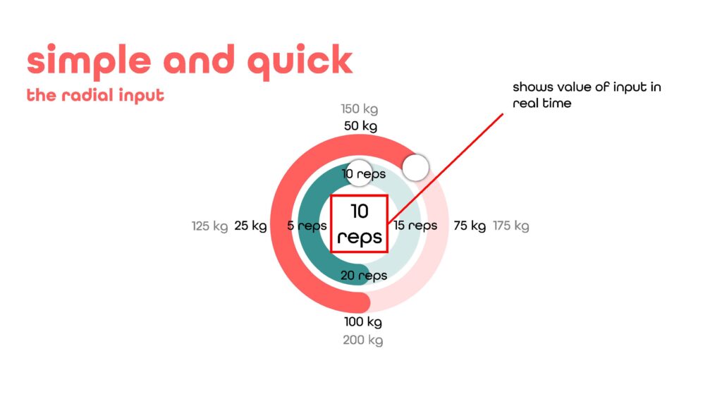
The design and branding was built around the main interaction with the radial inputs. Both, the typography as well as the UI elements don’t use corners, which contributes to a calm and consistent experience.
